
Frequence offers customizable reporting dashboards that allow advertisers to manage and analyze campaign performance.
As the customer base expanded, the team needed to bring a similar experience to smaller clients, within a shorter timeline and with limited engineering resources.
Rather than designing new dashboards from scratch, I focused on adapting a set of existing frameworks to support faster, more scalable delivery while maintaining a high-quality experience that felt distinct across partners.
Reporting dashboards were originally designed for larger clients, with timelines that allowed for fully custom builds.
As Frequence expanded to support smaller agencies, this approach no longer scaled. We needed a faster way to deliver dashboards without rebuilding from scratch each time.
At the same time, our dashboards were often used by competing partners as a marketing tool, so each experience still needed to feel distinct and polished.
How might we design dashboards that are quick to produce, require minimal engineering effort, and still deliver a high-quality, differentiated experience?
I adapted existing dashboard frameworks to create scalable, white-labeled variants with a more modern, usable UI across key components.
This approach reduced development effort and significantly shortened the time required to onboard new partners.
Advertisers can now more easily analyze campaign performance and generate downloadable, presentation-ready reports directly from the platform.
Earlier dashboards reflected outdated visual patterns and inconsistencies across components. I updated the visual system with simplified layouts, modern styling, and standardized components, creating a more cohesive, usable experience that aligns with current product standards.
Because dashboards were white-labeled with partner branding, accessibility needed to be balanced with brand constraints. In some cases, this required intentional tradeoffs to maintain visual identity while improving overall usability.
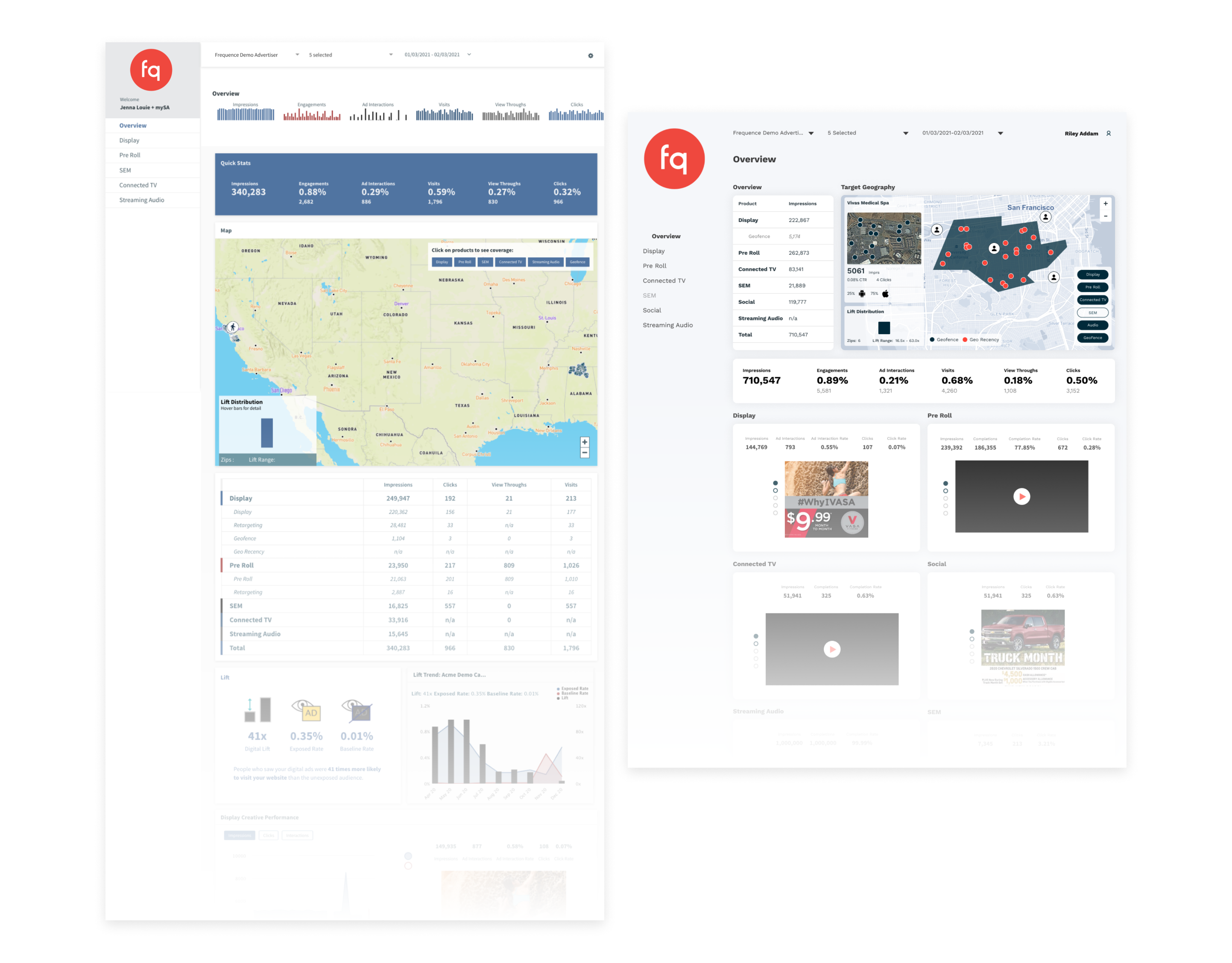
Before and after comparison of the dashboard UI, showing updated visual hierarchy, simplified layouts, and improved consistency across components.
The original layouts used a mix of widget sizes that often created visual imbalance and unused space. I refined the grid system and adjusted component sizing to create a more consistent, structured layout that improves scanability and use of space.
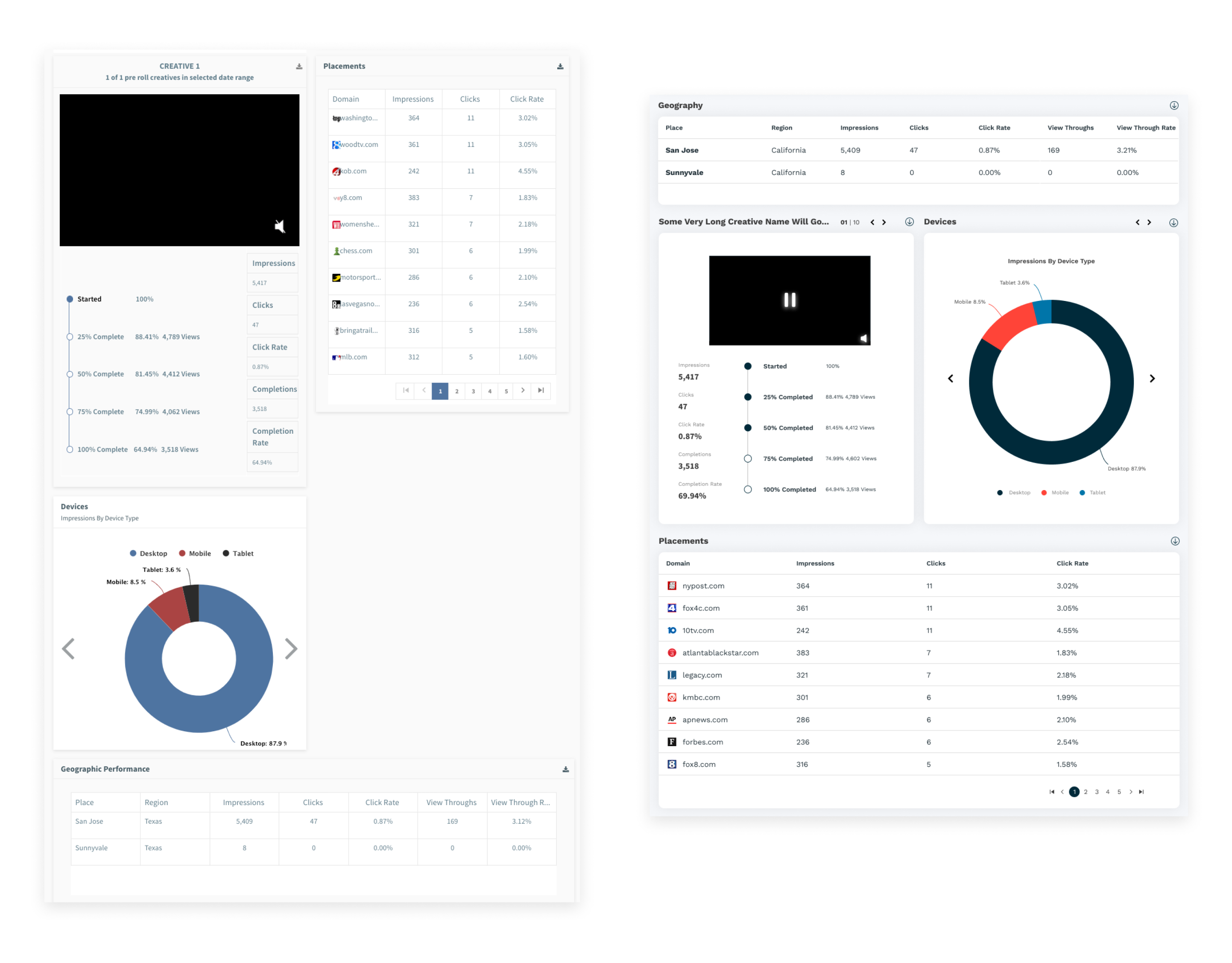
Layout refinements improved alignment and spacing, reducing visual imbalance and making dashboards easier to scan.
Several existing widgets did not adapt well across screen sizes, limiting usability. I redesigned key components to be fully responsive, ensuring content scales and reorganizes smoothly across devices.

Components were redesigned to adapt across screen sizes, ensuring key data remains readable and accessible on different devices.
Given the tight timeline and limited resources, the goal was to move quickly while making informed design decisions using existing knowledge and cross-functional input.
Due to resource constraints, we did not conduct any new primary research. Instead, I used prior internal research and collaborated closely with Product, Engineering, and Customer Success to understand user needs and partner requirements.
We aligned on priorities using a Lean UX approach, ensuring design decisions balanced user value with business goals.

Used Lean UX to align on priorities and define solutions across Product, Engineering, and Customer Success.
To better understand the scope and relationships between pages, I created a quick sitemap based on product requirements. This helped identify opportunities to streamline navigation and maintain consistency across dashboard variants.
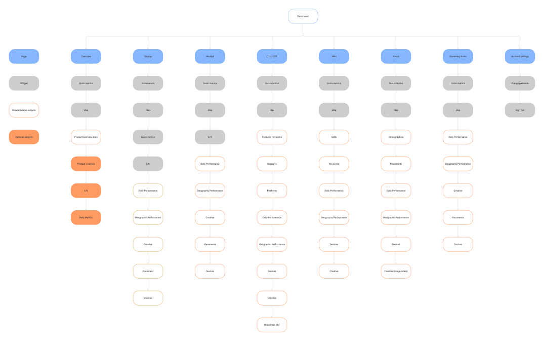
Sitemap used to map dashboard structure and ensure consistency across pages and variants.
I worked with the PM and lead engineer to define an impact vs effort framework for prioritizing features. This ensured we focused on high-value improvements that could be implemented quickly, supporting faster rollout without sacrificing quality.
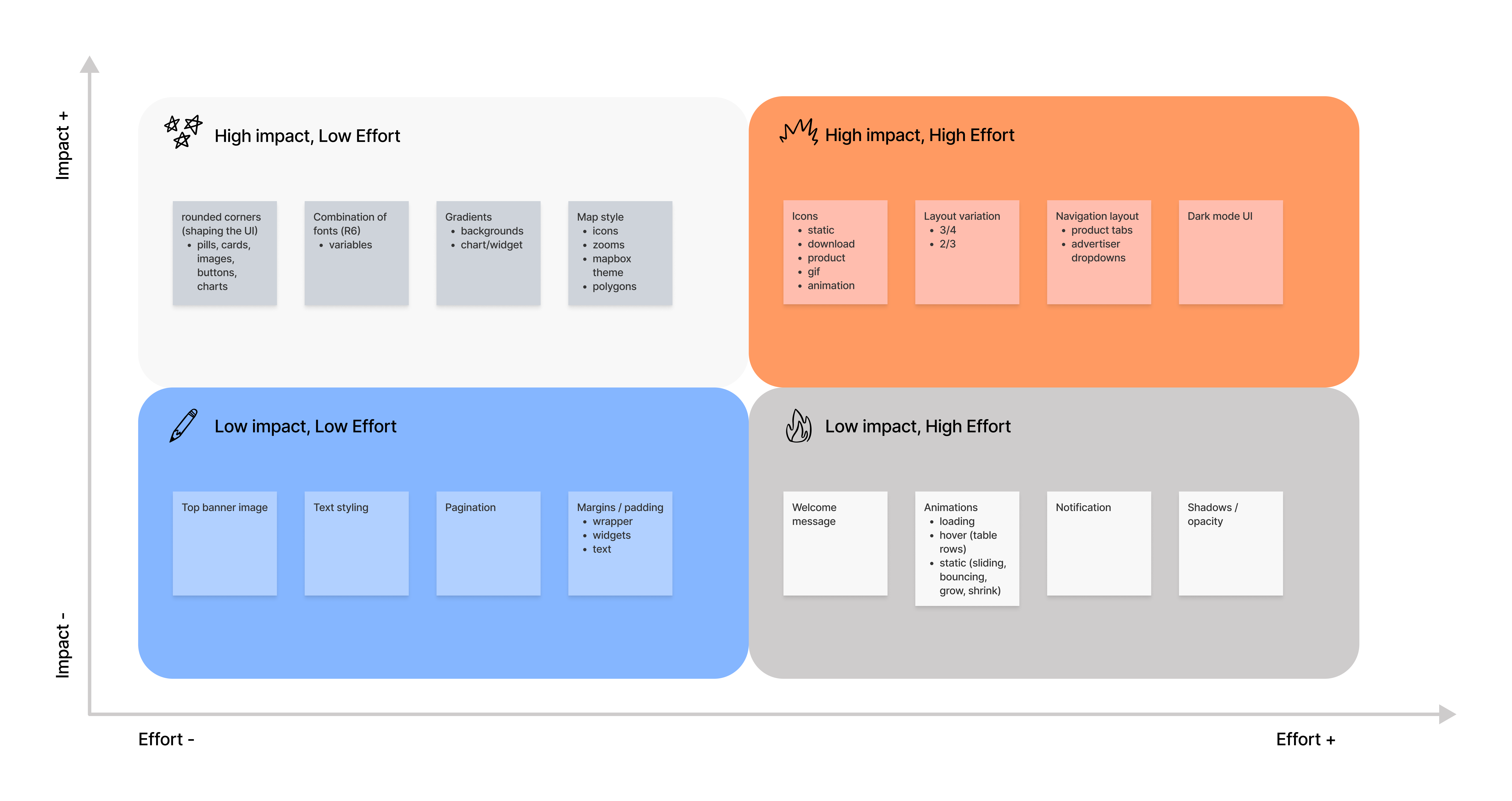
Feature prioritization matrix used to focus on high-impact improvements that could be implemented quickly.
Rather than designing from scratch, I built on existing dashboard structures, exploring layout variations and refining components to improve usability and visual hierarchy.
Designs were iterated quickly through ongoing feedback with engineering and Customer Success, allowing us to identify technical constraints and partner-specific needs early in the process.
I lead the visual design across these dashboards, introducing updated patterns and contributing to our shared UI library in Storybook. This helped ensure consistency across variants while making it easier for engineering to implement and extend the designs.

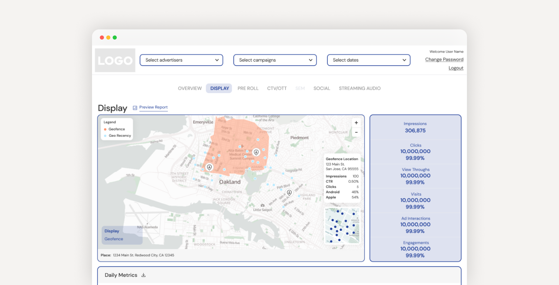
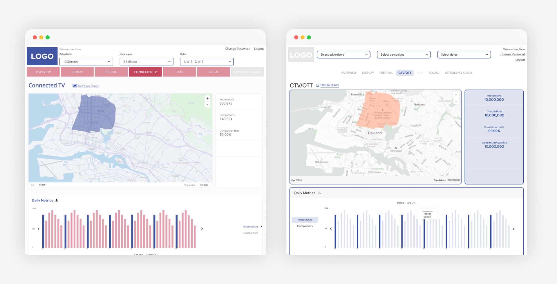
Example of how a single dashboard framework was adapted into multiple distinct dashboard variants for different partners.
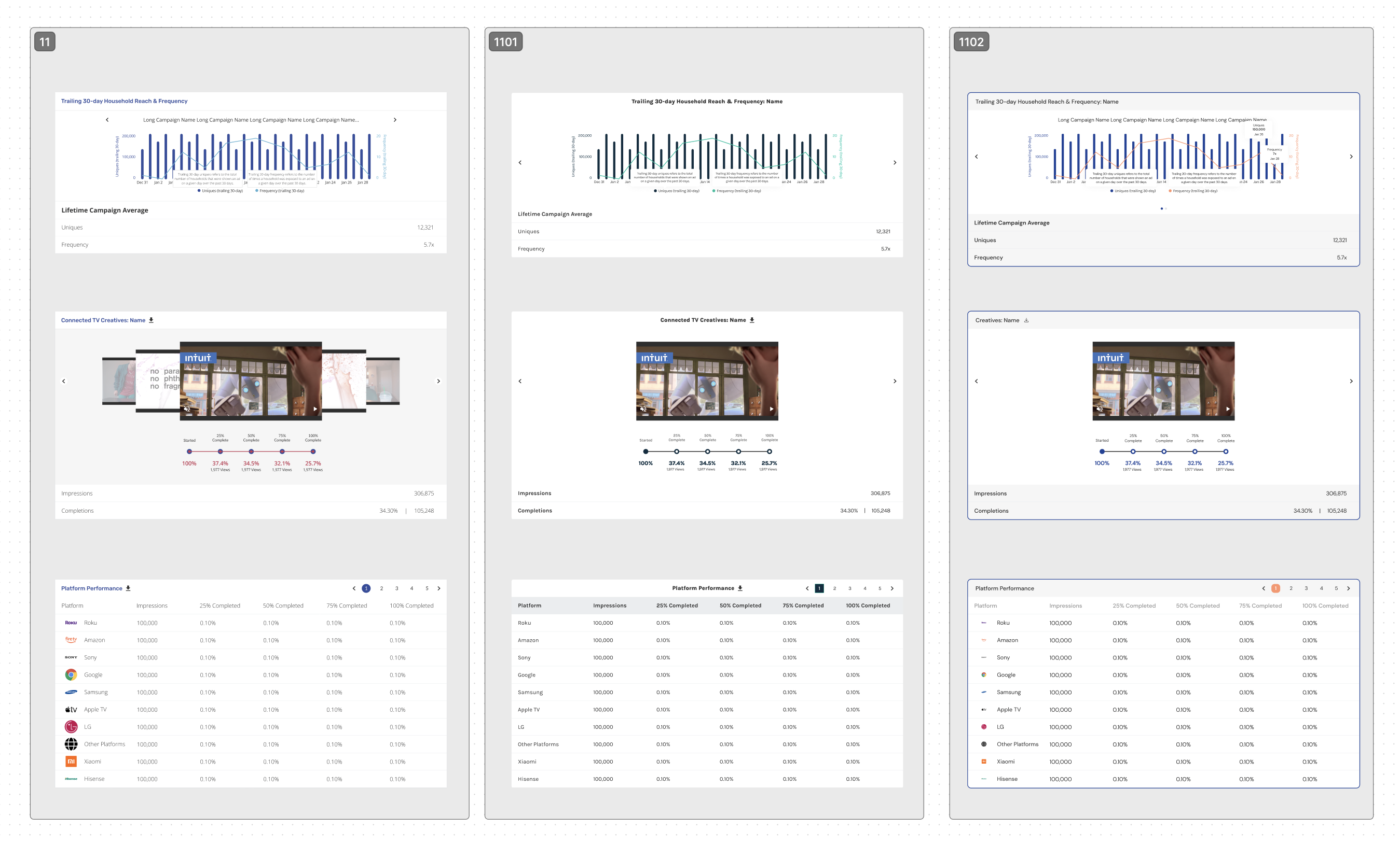
Example of how core components were adapted into flexible variations, enabling consistent yet customizable dashboards across different partners.
By adapting existing dashboard frameworks and focusing on lightweight UI updates, we significantly reduced the time and effort required to deliver new dashboards.
In addition to improving speed, this approach established a more scalable process for creating and maintaining reporting dashboards across the platform.
To better understand how advertisers use these dashboards, the next phase would focus on deeper user insights:
These insights would help inform future iterations and ensure the dashboards continue to meet evolving user needs.
